Aloha!
 |
| Aloha © Claire Belyea |
New Chapter
I'm in the newest chapter in my life. I was accepted in the Savannah College of Art and Design as an Animation major and have recently returned home in Oklahoma after two quarters there. I will be returning to (and possibly moving to) Savannah, Georgia this fall to continue my education.
In the mean time I am updating and revising all my social networks and websites. As it stands I've done an update on my business card as well.
 |
| Art © Claire Belyea |
Western Journey
Created this the same day as "Curiosity." I just forgot to post it. Speed painting is a lot of fun and gave me a chance to create a skyline I see often where I live. Midwest for the win!


"Western Journey" © Claire Belyea '13
Curiosity
So here is another piece I worked on yesterday. Why do I tend to post the day after I've created something? Oh well. No matter!
This is one of those paintings I love it while I work on it, but after I'm done I am not satisfied with it at all. It's okay, but I know I can do better.
At least I can draw a robot with noodle arms, I love noodle arms.

I don't think that robot is truly curious like the butterfly. I think it lured the butterfly with his glowing bulb. It's like a robot form of an angler fish! D: Fly away butterfly before he eats you! XD
Art © Claire Belyea
The Lantern Child
I worked on this yesterday as a last minute portfolio submission for SCAD, and because it's based on a design that I had been wanting to turn into an official piece.

Yea for minimal color schemes! And for Prismacolour Markers!

"The Lantern Child" © Claire Belyea 2013'
Eastern Breeze
I technically finished this a few days ago, but I did a quick touch up today. Hence why I didn't post it sooner, I knew I needed to touch up on some things but couldn't quite determine what those things were, so I didn't look at it for a day or two. That helped me a lot I think.
This composition had been in my head a good week before I actually sat down to create it. I wanted to be absolutely sure I could create what I saw, I'd say this is a good 98% accurate. :D I think I'm getting a little better with making landscapes/scenery more interesting.
 |
| "Eastern Breeze" © Claire Belyea '13 |
May Girls
While I waited at my booth back at the May arts and crafts fair I had my sketchbook with me and came up with these.....

I only sold a few prints, but the best part was when a young girl watched me while I drew these. Normally I really do not like people watch me draw, but she seemed to be in awe. It was rather flattering. :D This set is a little different than what I normally draw, but I was going for something more along the lines of children's book illustration. If I were to color this I don't think I will ink it. I want to keep the roughness it has.

"I like to think they're sisters, or three stages of one girl's life"
Feelin' the Blues......and Orange
Two works were done today. Both a similar theme. Blue and Orange! The second one was originally not going to end up that way but I found that without that splash of color it was to dull.
The first! A traditional piece done on bristol paper. Drawn and colored with Micron pens, Prismacolor and Copic markers.


The first! A traditional piece done on bristol paper. Drawn and colored with Micron pens, Prismacolor and Copic markers.

"Blue"
Felt like doing something a little on the retro side. That and a chance to get some more practice with markers and pens. :D It turned out okay, not really what I was hoping for, but good practice.
The second! Back to digital. I was warming up in photoshop, playing with brushes, making new ones. This was the result of a created brush.

"Rose"
Originally there was no rose. But after viewing it for a few minutes I decided this piece had a little to much blue to it. It needed that bit of orange to make it come to life....at least for me. I'm VERY happy with the outcome of this one. For some reason I'm far more confident with digital than traditional. I have no clue why really. I'm technically using everything I know from traditional methods. Not to mention I use a Cintiq which essentially mimics pencil on paper, movement and all. Oh well.
Frolic
I'll be selling prints at an Art and Crafts fair for my mother's work. Ten percent of what I make will go to them. Luckily for me I have an awesome coworker who was willing to switch shifts with me so I'll actually be able to man my own booth.
I'm not counting on being able to sell all my works, if anything I hope this will be a good experience for me. I'll be doing what I love and happen to make money for it. Versus working for money. I hope one day it really will become a full time salaried job for me at a studio or animation company. A girl can dream.
Anyway! I've been printing some of my newer and older works to sell, but it didn't seem to be enough. So I whipped this up.

"Frolic" © Claire Belyea 13'
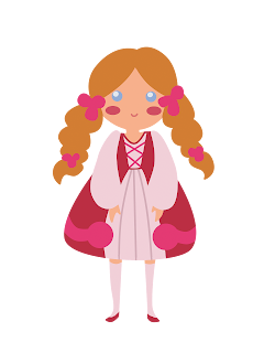
It's actually a rein-visioning of sorts. It's based on the center character I drew here ->

I made this to test the colors for red bubble.com to submit as a shirt design. However Redbubble is STILL not good about my colors on shirts coming out right so I gave up, and just kind of forgot about this.
There is a slight difference in style between the two, but only slight. Still cute, still adorable.
Subscribe to:
Posts (Atom)